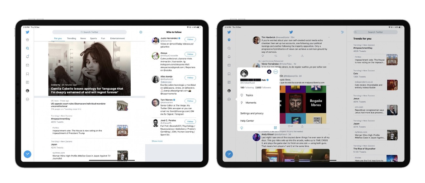
Up until now, Twitter on iPad adopted the exact same interface as on the iPhone, which meant iPad users were presented with a single timeline with two big white unused spaces on either side of it.
Fortunately, the update sees Twitter for iPad ditch the single timeline layout of the previous version and replace it with a multi-column view that works in both portrait and landscape mode and puts a lot more content at the user's fingertips.
If the design looks familiar, that's because it's pretty similar to the Twitter web app layout. The menu bar has been relocated from the bottom of the screen to the left side of the timeline, while trending topics and other variable content appear on the right side of the timeline.
Unlike third-party clients, Twitter has seemingly opted to keep things simple in its official app, as there's no way to customize the three-column view to display things like additional timelines, direct messages, or mentions. But the update at least means the additional screen real estate of iPad is no longer being under-utilized.
Twitter on iPad is a free download available on the App Store, while existing users of the app can update to the new version today. [Direct Link]
Tag: Twitter
This article, "Twitter for iPad Updated With Redesigned Interface and Multi-Column Layout" first appeared on MacRumors.com
Discuss this article in our forums
via MacRumors: Mac News and Rumors - All Stories https://ift.tt/34DdFT4
No comments:
Post a Comment